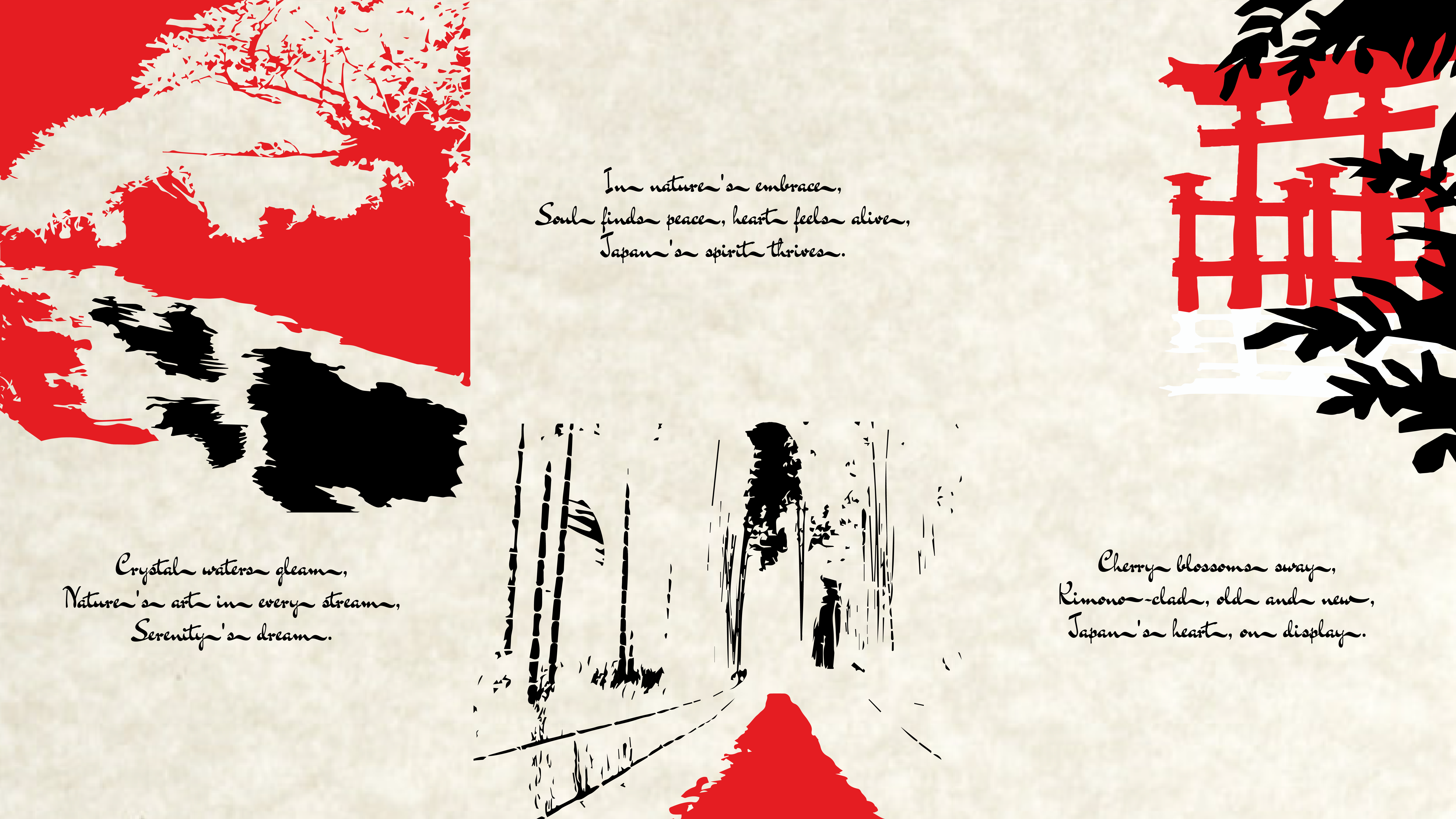
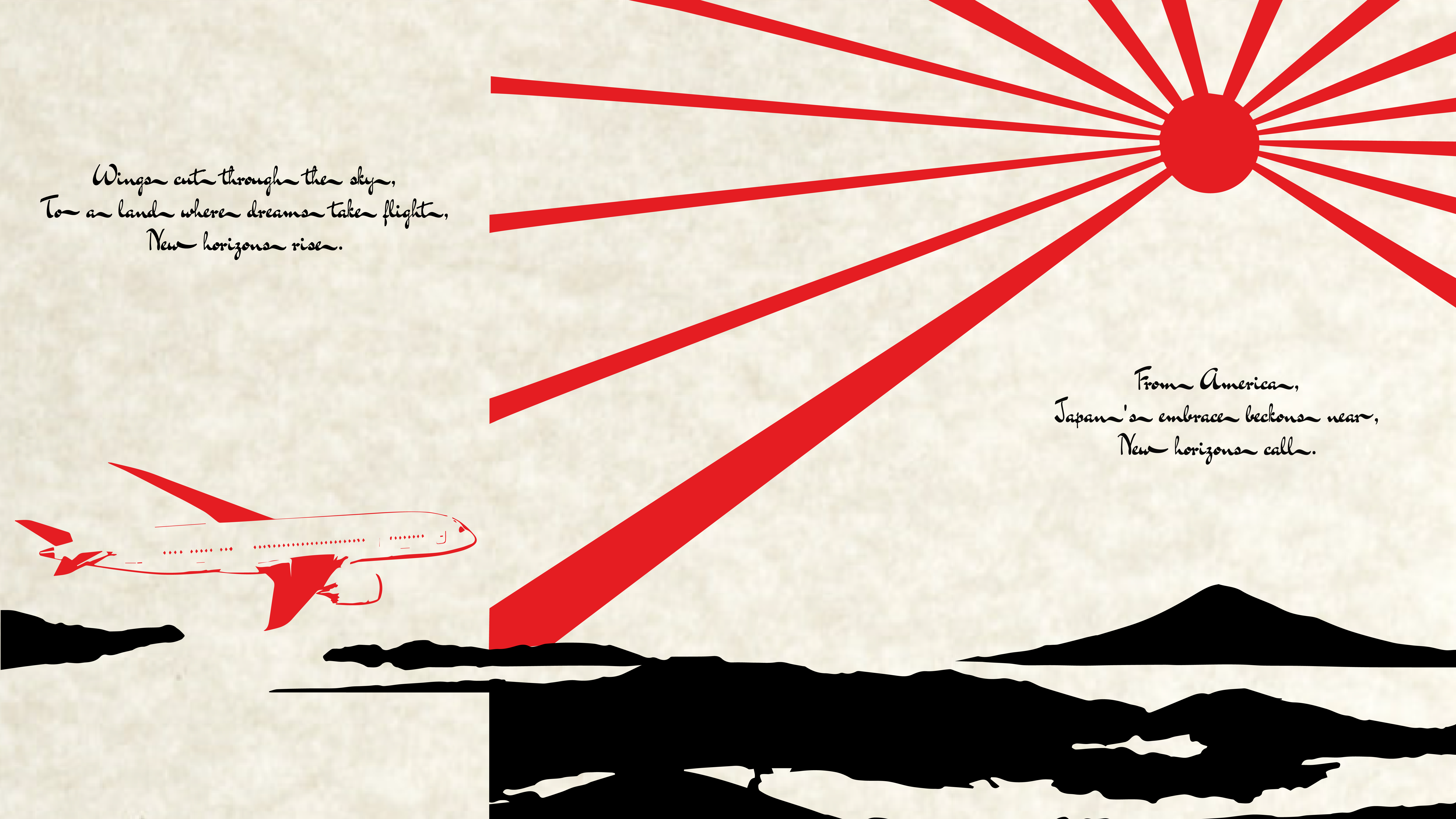
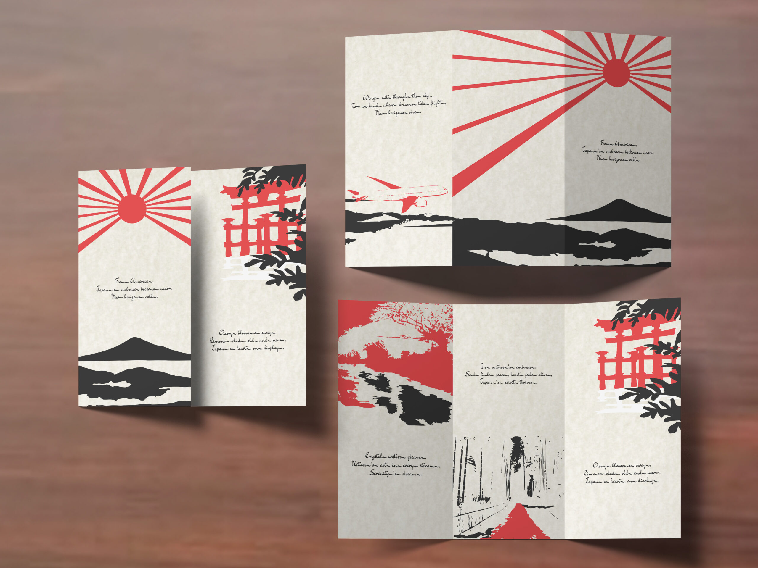
The travel brochure employs a minimalist approach to its design, utilizing only two colors: red and black. These colors are chosen to illustrate tranquil images of Japan and the journey to Japan. The font selected imitates the hand-brushed strokes of Japanese calligraphy, adding an authentic touch to the design. Each step of the journey, intended for young adults, specifically singles or couples without children, will be written in haiku, aiding in immersing the adventurers into the amazing narrative of setting out to Japan.
From the moment one sets eyes on the brochure, the minimalist design evokes a sense of tranquility and anticipation. The red and black color scheme, reminiscent of the Japanese flag, draws the reader’s attention, creating a connection with the destination before even delving into the content. The brochure doesn’t provide direct information; instead, it encourages the reader to gather more information from the travel agency. The minimalist design, accompanied by the haiku, creates a captivating narrative, drawing the reader into the enchanting world of Japan. The brochure not only serves as an invitation but also as a gateway to an unforgettable journey, enriching the traveler’s experience before they even set foot on Japanese soil.